


Your Ultimate Guide to Choosing Paint Colors for Every Room
Understanding the Fundamentals: Color Theory & Mood
Before we dive into specific rooms, let’s lay a foundational understanding of how color works and, more importantly, how it makes us feel. Think of it as the secret language your walls speak.
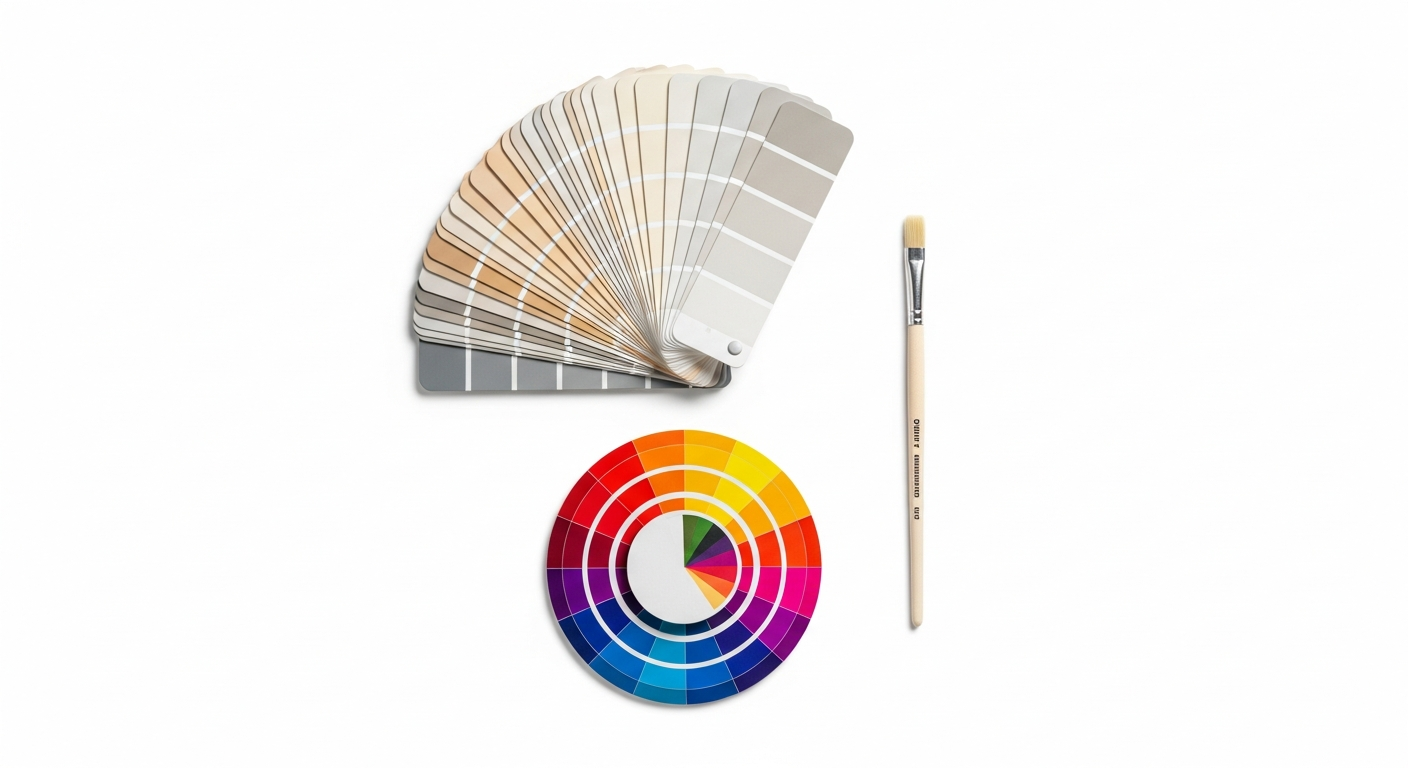
First, a quick nod to the color wheel:
* Primary Colors (Red, Yellow, Blue): The building blocks.
* Secondary Colors (Orange, Green, Purple): Created by mixing two primaries.
* Tertiary Colors: Mixing a primary and a secondary.
While you don’t need to memorize the entire wheel, understanding the relationship between colors helps you create harmony or exciting contrast.
Now, let’s talk about the psychological impact of color – this is where the magic truly begins:
* Warm Colors (Reds, Oranges, Yellows): These hues are energetic, inviting, and can make a large room feel cozier. They stimulate conversation and create a sense of warmth and cheer. Imagine a sunny yellow kitchen or a rich terracotta dining room.
* Cool Colors (Blues, Greens, Purples): Serene, calming, and expansive, cool colors are perfect for creating tranquil retreats. They can make smaller rooms feel larger and bring a breath of fresh air into any space. Think of a spa-like blue bathroom or a peaceful green study.
* Neutrals (Grays, Beiges, Whites, Off-whites): Oh, our beloved neutrals! These are the unsung heroes of interior design. They provide a sophisticated backdrop, allowing your furniture, art, and accessories to shine. Neutrals are incredibly versatile, offering a sense of calm and elegance. But remember, even neutrals have undertones – a warm gray might lean towards beige, while a cool gray might have a blue or green tint. Understanding these undertones is crucial for avoiding clashes and creating a cohesive look.
Embracing Undertones: This is where many folks get tripped up. Undertones are the subtle colors beneath the dominant hue. A seemingly pure gray might have a green, blue, purple, or even a yellow undertone. A white can be crisp and cool with a hint of blue, or creamy and warm with a touch of yellow. These undertones become evident when placed next to other colors, especially your existing fixed elements like flooring, cabinetry, and upholstery. Pay close attention to them; they are the secret to a truly harmonious palette. A good trick is to compare your paint chip to a pure version of a color (e.g., a pure blue, a pure green) to discern its leanings.
Your Paint Color Playbook: Gathering Inspiration & Building a Palette

Now that we understand the basics, let’s gather our creative muses and start building a palette that feels uniquely you. This isn’t just about picking pretty colors; it’s about curating an experience.
Where to Find Your Muse: Inspiration is everywhere, darling!
* Nature: The soft blues of the sky, the earthy greens of a forest, the vibrant hues of a sunset, the gentle warmth of sand. Nature’s palettes are always harmonious.
* Fashion & Art: A favorite scarf, a beloved painting, a stunning photograph – these often reveal colors and combinations you’re naturally drawn to.
* Travel Memories: The vivid blues of the Mediterranean, the warm spice tones of a Tuscan villa, the crisp whites of a Scandinavian retreat.
* Existing Decor: Look to your favorite rug, a cherished piece of furniture, artwork, or textiles. These items already have a place in your heart and home; let them guide your color choices. They’re a perfect starting point for building a cohesive palette.
* Magazines & Blogs (like Rock Salt Plum!): Of course, visual resources are invaluable. Pin images that evoke the feeling you want for your space, paying attention not just to the wall color but the entire mood created.
The Power of the Mood Board: Whether you’re a digital enthusiast using Pinterest and online tools, or a traditionalist who loves cutting out swatches and fabric samples, a mood board is your best friend.
* Physical Mood Board: Gather paint chips (many, many paint chips!), fabric swatches, photos of furniture, flooring samples, magazine cutouts, and anything that inspires you. Arrange them together. How do they interact? Do they create the desired feeling? This tactile experience is incredibly helpful.
* Digital Mood Board: Create a dedicated Pinterest board or use a design app. This allows for easy organization and sharing. The key is to see all your elements together, not in isolation.
Considering Your Home’s Fixed Elements: Before you fall head over heels for a paint color, take a good, hard look at what’s already fixed in your home. These are the elements you likely won’t be changing anytime soon, and your paint choices need to complement them beautifully.
* Flooring: Hardwood tones (red oak, white oak, dark walnut), carpet colors, tile patterns.
* Cabinetry: Kitchen and bathroom cabinets are significant color anchors.
* Countertops: Granite, quartz, marble – their patterns and base colors are vital.
* Trim and Moldings: Are they a crisp white, an off-white, or stained wood? This sets the stage for how wall colors will appear.
* Fireplaces or Built-ins: Stone, brick, or painted wood will all influence your palette.
These fixed elements often have strong undertones themselves, which makes understanding paint undertones even more important. Bring your paint chips right up against your flooring, countertops, and cabinetry. You’ll quickly see if they sing in harmony or create a jarring discord.
The Art of Flow: Harmonizing Colors Across Your Home
A truly well-designed home doesn’t just have beautiful rooms; it has a beautiful journey from one room to the next. Creating a sense of flow and cohesion with your paint colors is paramount, especially in open-concept living.
Connecting Adjacent Spaces:
* The “Whole House” Palette: Consider choosing a main neutral color that you love and using it in hallways, entryways, and perhaps even an open-concept living area. This creates a consistent backdrop and allows other rooms to introduce pops of color without feeling disconnected. You can then use variations of this neutral – a lighter shade in one room, a slightly deeper one in another – to add subtle interest while maintaining harmony.
* Using Complementary Colors: If you want distinct colors in adjacent rooms, ensure they share a common undertone or are complementary on the color wheel. For instance, a soft blue-gray living room could flow beautifully into a muted green dining room if both colors have a similar cool undertone.
* Strategic Accent Walls: While we adore a good accent wall, use them thoughtfully. An accent wall in a bold color should ideally relate to another color found elsewhere in your home, perhaps in an accessory in an adjacent room, to maintain connection. They are wonderful for adding drama and defining zones within a larger space.
* The “Bridge” Color: Sometimes, a small element in one room can serve as a “bridge” to the next. For example, a throw pillow with a touch of mustard yellow in your living room could inspire a soft, buttery yellow in your adjacent sunroom.
Trim, Ceilings, and Doors – The Unsung Heroes:
* Trim: Most homes opt for white or off-white trim, which provides a crisp contrast to wall colors. However, don’t be afraid to experiment! Painting trim the same color as your walls (especially in an eggshell or satin finish for subtle contrast) can create a wonderfully sophisticated, enveloping feel, making rooms feel taller. For a bold statement, consider painting trim a contrasting color.
* Ceilings: The “fifth wall” is often overlooked. While a bright white ceiling is classic and lifts the room, consider painting your ceiling a lighter shade of your wall color (perhaps 25-50% lighter), or even a very pale blue to mimic the sky, especially in bedrooms. This can create a truly custom, designer look. For dramatic rooms like dining rooms or powder rooms, a darker, moodier ceiling can be incredibly impactful.
* Interior Doors: Typically, interior doors match the trim color. However, painting them a fun accent color can add an unexpected pop of personality, especially in a hallway or leading to a child’s room.
Remember, the goal is not for every room to be the same, but for them to feel like members of the same lovely family. Each space can have its own personality while contributing to the overall graciousness of your home.
Designing with Intention: Paint Color Choices for Key Living Spaces

Now for the fun part – let’s talk about specific rooms and how to choose colors that enhance their function and mood.
The Welcoming Embrace: Living Room & Family Room
Your living room is often the heart of your home, a place for gathering, relaxation, and entertaining. The color here should reflect your overall style and set a welcoming tone.
* For a Bright & Airy Feel: Soft whites, warm grays, or pale blues can create a serene and expansive atmosphere. These provide a beautiful backdrop for colorful furniture and art. Consider a crisp off-white with a hint of warmth if your room gets a lot of natural light.
* For Cozy & Inviting: Deeper blues, warm greens, or even a rich charcoal can create a more intimate and enveloping space, perfect for movie nights or deep conversations. Think about jewel tones if you want a luxurious, sophisticated vibe.
* Southern Charm: A soft, muted sage green or a creamy ivory can evoke a timeless, comfortable elegance, pairing beautifully with natural wood tones and plush fabrics.
* Pro Tip: If your living room is open to other areas, ensure its color harmonizes with adjacent spaces to maintain flow.
The Heart of the Home: Kitchen
The kitchen is a hub of activity, creativity, and often, delicious aromas. Paint colors here need to be practical yet inspiring.
* Fresh & Clean: Whites, light grays, and pale blues are eternally popular for kitchens, creating a sense of cleanliness and brightness. They also provide a versatile canvas for cabinetry and backsplashes.
* Warm & Inviting: Creamy yellows, soft greens, or even a very light terracotta can add warmth and a touch of rustic charm, especially appealing in a kitchen where you entertain.
* Modern & Chic: Deeper grays, even black on an accent wall, can create a dramatic, contemporary look, especially when paired with sleek cabinetry and metallic accents.
* Consider Cabinetry: Your cabinet color is a major factor. If you have dark cabinets, lighter walls will provide balance. If your cabinets are light, you have more freedom to go bolder on the walls.
* Pro Tip: Kitchens benefit from durable, easy-to-clean finishes like eggshell or satin.
Elegance & Conversation: Dining Room
The dining room is where cherished memories are made over shared meals. It’s a space that often lends itself to a bit more drama and sophistication.
* Intimate & Elegant: Deep jewel tones like emerald green, sapphire blue, or a rich burgundy can create a luxurious, intimate atmosphere perfect for evening entertaining. These colors can make a room feel grand and special.
* Sophisticated Neutrals: A deep, warm gray or a rich taupe can be incredibly elegant, allowing your dining table and artwork to be the stars of the show.
* Bright & Festive: If your dining room is used more for casual gatherings or enjoys abundant natural light, a cheerful yellow or a light, airy blue can feel wonderfully inviting.
* Pro Tip: Consider a bold wallpaper on one wall, or a striking paint color on the ceiling to create a truly memorable space.
Crafting Your Private Retreats: Bedrooms, Bathrooms & Home Offices
These are your personal sanctuaries, spaces where you can unwind, refresh, or focus. The paint colors here should support their specific functions.
Your Sleep Sanctuary: Bedroom
Your bedroom should be a haven of rest and relaxation. Choose colors that promote calm and comfort.
* Calm & Serene: Soft blues, gentle greens, and muted lavenders are classic choices for promoting sleep and tranquility. These cool tones create a peaceful atmosphere.
* Cozy & Romantic: Warm neutrals like creamy off-whites, soft beiges, or light grays with warm undertones can create a soothing, inviting space. Consider a blush pink for a touch of gentle romance.
* Deep & Enveloping: For a truly cocoon-like feel, especially in a master bedroom, don’t shy away from deeper, muted tones like a dark teal, a smoky blue, or even a rich charcoal. These colors can feel incredibly luxurious and restful.
* Pro Tip: Consider the color of your bedding and curtains – your paint choice should complement these significant textile elements. For a truly cohesive look, paint your ceiling a lighter shade of your wall color.
Spa-Like Refreshment: Bathroom
Bathrooms are often smaller spaces, and the paint color needs to enhance cleanliness, brightness, and a sense of calm.
* Crisp & Clean: Whites and off-whites are timeless choices, making the bathroom feel fresh and hygienic. They also work beautifully with white fixtures.
* Spa-Like Retreat: Soft blues, aquas, and seafoam greens are perfect for creating a tranquil, spa-like ambiance. These colors are inherently refreshing.
* Sophisticated Small Space: A deep, rich color like navy blue or a charcoal gray can actually make a small powder room feel more luxurious and intentional, rather than smaller. It’s a wonderful place to experiment!
* Pro Tip: Ensure your chosen color complements your tile and vanity. Opt for a semi-gloss or satin finish for durability and moisture resistance.
Focus & Inspiration: Home Office / Study
With more of us working from home, the home office needs to be a space that fosters productivity and creativity.
* Productive & Focused: Muted greens and blues are excellent for concentration. They are calming yet stimulating. A soft sage green or a deep navy can be incredibly effective.
* Energizing & Creative: If your work requires a spark of creativity, consider a soft yellow or a light orange, but use them cautiously so they don’t become overwhelming.
* Sophisticated & Grounded: Rich browns, deep grays, or even a library-inspired forest green can create a scholarly, sophisticated atmosphere that feels grounded and serious.
* Pro Tip: If your office is visible from other living areas, ensure its color harmonizes with the overall home palette. Good lighting is paramount in a home office, so choose colors that won’t feel harsh under task lighting.
The Practicalities: Sampling, Finishes, and Expert Tips
You’ve gathered inspiration, built your palette, and considered your rooms. Now, let’s talk about bringing those beautiful ideas to life with practical steps that ensure a stunning result.
The Golden Rule: Sample, Sample, Sample!
This cannot be stressed enough, darling. Paint chips are a wonderful starting point, but they are tiny and don’t reflect how a color will look on a large wall in your home’s unique lighting conditions.
* Buy Sampler Pots: Most paint brands offer small sample pots.
* Paint Large Swatches: Don’t just paint a tiny square! Paint at least two large (2’x2′ or larger) swatches on different walls in the room you’re planning to paint. This allows you to see how the color behaves on different planes and in varying light.
* Observe Throughout the Day: Watch your samples morning, noon, and night. See how they look under natural light and your artificial lighting. Colors can shift dramatically!
* Live with It: Leave the samples up for a few days, even a week, if you can. This gives you time to truly decide if you love it.
* Compare with Furnishings: Bring your fabric swatches, throw pillows, and even small pieces of art next to the painted samples to ensure everything harmonizes.
Choosing the Right Paint Finish:
The sheen of your paint isn’t just aesthetic; it affects durability and how light reflects.
* Flat/Matte: Has no sheen, hides imperfections well, and provides a rich, velvety look. Best for ceilings, low-traffic areas like formal dining rooms, or bedrooms where durability isn’t the primary concern. Not easily washable.
* Eggshell: A very subtle sheen, resembling an eggshell. More durable and washable than flat, making it a popular choice for living rooms, dining rooms, and bedrooms.
* Satin: A slightly higher sheen than eggshell, with a smooth, pearl-like finish. Very durable and easy to clean, ideal for high-traffic areas like kitchens, bathrooms, hallways, and kids’ rooms.
* Semi-Gloss: A noticeable shine, very durable, and highly washable. Perfect for trim, doors, cabinets, and areas needing extra protection like bathrooms and kitchens.
* High-Gloss: The highest sheen, very reflective, and incredibly durable. Used for statement pieces, furniture, or to create a dramatic, lacquered look on trim or doors. Requires very smooth surfaces as it highlights imperfections.
The Unsung Hero: Primer:
Don’t skip primer! It creates a uniform surface for your paint, helps block stains, improves paint adhesion, and ensures true color rendition, especially when painting over a dark color with a lighter one. It’s a small extra step that makes a world of difference in the final result.
Quality Tools Make a Difference:
Invest in good quality brushes, rollers, and painter’s tape. They make the application smoother, reduce streaks, and generally make the painting process more enjoyable and the results more professional.
Don’t Rush the Process:
Choosing paint colors is a journey, not a race. Give yourself time to explore, sample, and make confident decisions. This is your home, after all, and you want to love every single hue.
Conclusion: Embrace the Joy of Color
Choosing paint colors for your home is an adventure, a chance to infuse every corner with your unique spirit. It’s a journey of discovery, where a splash of color can uplift, soothe, and inspire. Remember, there’s no single “right” answer, only the right answer for you and your sweet home. Approach the process with an open heart, trust your instincts, and don’t be afraid to experiment with those samples. With this guide in hand, you’re well-equipped to create spaces that feel authentically yours – warm, welcoming, and utterly beautiful, just like a Rock Salt Plum home. So go forth, darling, pick up those swatches, and paint your world with joy! We can’t wait to see the beautiful home you create.