


Bedroom Color Schemes and Palettes: Your Ultimate Guide for a Dreamy Sanctuary in 2026
At Rock Salt Plum, we believe your home should be a reflection of your soul, a place that nurtures and uplifts. In this comprehensive guide, we’ll journey through the fascinating world of bedroom color schemes and palettes, equipping you with the knowledge and inspiration to design a space that feels utterly perfect for you. From understanding the psychology of hues to layering textures and incorporating personal touches, prepare to transform your bedroom into the ultimate retreat you’ve always envisioned.
Understanding Color Psychology: Crafting Your Emotional Landscape
Before you even pick up a paint swatch, it’s crucial to understand the profound impact colors have on our emotions and state of mind. Each hue carries its own unique energy, capable of evoking feelings of calm, energy, warmth, or introspection. In your bedroom, the goal is often to foster tranquility, promote relaxation, and encourage restful sleep. However, your personal preference and desired mood should always be the guiding star.
Consider these psychological associations when selecting your palette:
- Blues: Universally calming and serene, blues are excellent for promoting relaxation and reducing stress. Think of a clear sky or the gentle ocean. Lighter shades like Sherwin-Williams’ “Upward” (their 2024 Color of the Year) or Benjamin Moore’s “Palladian Blue” are perfect for a restful atmosphere.
- Greens: Evoking nature and renewal, greens bring a sense of balance, harmony, and freshness. They are known to be restorative and can help reduce anxiety. Sage greens, mint, or deeper forest hues like Farrow & Ball’s “Bancha” create an earthy, grounding feel.
- Pinks: Soft pinks are nurturing, comforting, and associated with love and tenderness. They can create a warm, inviting, and slightly romantic atmosphere without being overly saccharine. Consider muted dusty rose tones or blush shades.
- Purples/Lavenders: Often linked with luxury, creativity, and spirituality, lighter lavenders can be very soothing and help with relaxation. Deeper purples should be used sparingly, perhaps as an accent.
- Neutrals (Grays, Beiges, Whites): These form the perfect backdrop for any style, offering versatility and a sense of calm. They allow other elements in the room to shine and can be incredibly sophisticated. A warm gray like Benjamin Moore’s “Revere Pewter” or a creamy white like Sherwin-Williams’ “Alabaster” provides a timeless foundation.
- Yellows: While bright yellows can be stimulating, softer, muted yellows or golden tones can bring warmth, optimism, and a gentle glow, especially in rooms lacking natural light.
- Oranges/Reds: These are highly energetic and stimulating colors, generally best avoided as dominant shades in a bedroom. However, subtle terracotta accents or deep rust tones can add warmth and sophistication in smaller doses, particularly in bohemian or Mediterranean-inspired spaces.
Think about how you want to *feel* when you step into your bedroom. Do you crave a cool, spa-like retreat, a cozy, enveloping cocoon, or a bright, airy sanctuary? Your emotional desired outcome will guide your primary color choices.
The Foundation: Choosing Your Base Palette and Dominant Hues
1. The Power of Neutrals: Timeless & Versatile
Neutrals are the unsung heroes of interior design. They provide a serene backdrop that allows textures, furniture, and art to truly shine. For 2026, we’re seeing a continued love affair with nuanced neutrals:
- Warm Whites & Creams: Far from sterile, these whites have subtle undertones of yellow, pink, or beige, creating a soft, inviting glow. Think Benjamin Moore’s “White Dove” or Farrow & Ball’s “Wimborne White.” They pair beautifully with natural wood, linen, and soft pastels.
- Soft Grays: Moving away from stark, cool grays, the trend is towards “greige” (gray-beige) or grays with warm undertones. These offer sophistication without feeling cold. Sherwin-Williams’ “Agreeable Gray” is a perennial favorite for a reason.
- Earthy Beiges & Tans: These hues bring warmth and grounding, reminiscent of natural landscapes. They work wonderfully in organic modern, bohemian, or Mediterranean-inspired bedrooms. Look for shades with slight green or pink undertones to avoid feeling dated.
2. Embracing Color: Dominant Hues for Impact
If you’re ready to embrace more color on your walls, consider these options:
- Soft Blues & Greens: As discussed, these are ideal for creating a tranquil atmosphere. A muted blue-gray or a pale sage green can feel like a breath of fresh air.
- Dusty Pinks & Terracottas: For a touch of warmth and personality, these offer a sophisticated alternative to traditional neutrals, especially when paired with natural materials.
- Deep, Muted Tones (Accent Wall): If you crave drama, consider a single accent wall in a deep jewel tone like a rich emerald, a deep navy, or a charcoal gray. This adds depth without overwhelming the space. Ensure the rest of the palette is kept light and balanced.
When selecting your dominant color, always test swatches on your wall at different times of day to see how natural and artificial light affects the shade. A color that looks perfect in the store might appear entirely different in your home.
Popular Bedroom Color Schemes for 2026: Inspiring Palettes
Let’s dive into some of the most captivating and trending bedroom color schemes that will define serene spaces in 2026. These palettes offer a starting point, but remember to infuse your own personality into each one.
1. The Serene Coastal Retreat
Imagine waking up to the gentle lull of the ocean. This scheme focuses on tranquility and natural elements.
- Dominant Colors: Soft blues (e.g., Benjamin Moore “Beach Glass”), sandy beiges (e.g., Sherwin-Williams “Accessible Beige”), and crisp whites (e.g., “Chantilly Lace”).
- Accent Colors: Muted greens, coral, or deep navy for contrast.
- Materials: Rattan, linen, driftwood, light-toned woods, woven textures.
- Key Elements: Sheer curtains, natural fiber rugs, simple white bedding, botanical prints or abstract art with watery motifs.
2. Warm Earth & Desert Modern
Inspired by sun-drenched landscapes and natural warmth, this palette is grounding and inviting.
- Dominant Colors: Terracotta (e.g., Farrow & Ball “Red Earth”), warm sand, creamy off-whites, and muted olive greens.
- Accent Colors: Deep rust, charcoal, or a touch of black for modern edge.
- Materials: Raw wood, leather, clay pottery, textured plaster, wool, linen.
- Key Elements: Low-slung furniture, tribal-inspired textiles, cactuses or succulents, abstract art with organic shapes. Consider a statement headboard in a rich, warm wood.
3. The Scandinavian Haven
Emphasizing simplicity, functionality, and light, this scheme promotes calm and uncluttered living.
- Dominant Colors: Cool grays (e.g., Benjamin Moore “Gray Owl”), crisp whites, and pale wood tones.
- Accent Colors: Soft pastels (blush pink, pale mint) or deep charcoal/black for graphic contrast.
- Materials: Light woods (birch, ash), wool, cotton, faux fur, minimalist metal accents.
- Key Elements: Clean lines, functional furniture, layered textures in white and gray, minimalist artwork, plenty of natural light, and perhaps a sheepskin rug.
4. Romantic Bohemian Luxe
A blend of free-spirited charm and sophisticated elegance, this palette is rich in texture and personality.
- Dominant Colors: Dusty rose, deep teal, creamy white, and warm gold.
- Accent Colors: Emerald green, burgundy, or mustard yellow.
- Materials: Velvet, silk, macrame, carved wood, brass, rattan, patterned textiles.
- Key Elements: Layered rugs, ornate headboard, eclectic art, fringed or tasseled throws, an abundance of throw pillows, and perhaps a vintage chandelier.
5. Urban Chic & Sophisticated Neutrals
For those who love modern elegance and a refined aesthetic, this scheme uses a monochromatic approach with subtle variations.
- Dominant Colors: A range of grays from light silver to charcoal, deep taupe, and crisp white.
- Accent Colors: Metallics (silver, chrome), deep navy, or a single pop of jewel tone like amethyst.
- Materials: Polished chrome, glass, high-gloss finishes, velvet, silk, leather, dark wood.
- Key Elements: Sleek furniture, geometric patterns, striking modern art, luxurious bedding, and strategic lighting to highlight textures.
Comparison Table: Popular Bedroom Color Scheme Characteristics
To help you visualize and compare, here’s a quick overview of some popular schemes:
| Color Scheme | Dominant Hues | Mood/Feeling | Key Materials/Textures | Ideal For |
|---|---|---|---|---|
| Coastal Retreat | Soft Blues, Sandy Beiges, Whites | Calm, Serene, Refreshing | Linen, Rattan, Driftwood, Light Wood | Relaxation, Beach House Vibes |
| Warm Earth & Desert Modern | Terracotta, Warm Sand, Olive Green | Grounding, Inviting, Natural | Raw Wood, Clay, Textured Plaster, Wool | Cozy Ambiance, Organic Feel |
| Scandinavian Haven | Cool Grays, Crisp Whites, Pale Woods | Minimalist, Peaceful, Bright | Birch, Wool, Cotton, Faux Fur | Clean Lines, Uncluttered Space |
| Romantic Bohemian Luxe | Dusty Rose, Deep Teal, Cream, Gold | Eclectic, Luxurious, Expressive | Velvet, Silk, Macrame, Brass, Carved Wood | Personalized, Richly Textured Space |
| Urban Chic & Sophisticated Neutrals | Grays (light to charcoal), Taupe, White | Elegant, Modern, Refined | Polished Chrome, Glass, Velvet, Leather | Sleek, Contemporary Living |
Beyond Paint: Incorporating Color Through Textiles & Decor
While wall color sets the stage, the true magic of a bedroom palette comes alive through thoughtful layering of textiles, furniture, and decorative accents. These elements allow you to introduce depth, texture, and subtle shifts in hue without committing to a full repaint.
1. Bedding: The Heart of Your Bedroom
Your bed is the focal point, and its linens are a prime opportunity to express your chosen palette. Think about:
- Base Layers: Start with solid, neutral sheets (white, cream, light gray) for versatility.
- Duvet/Quilt: This can be your dominant color statement. A soft blue duvet for a coastal feel, a terracotta linen duvet for an earthy vibe, or a crisp white one for Scandinavian simplicity. Brands like Parachute Home or Brooklinen offer beautiful, high-quality options in a range of sophisticated colors.
- Pillows: Layer decorative pillows in varying shades and textures that complement your duvet. Mix patterns (subtle stripes, botanical prints) with solids.
- Throws: A chunky knit throw from Pottery Barn or a delicate cashmere throw draped at the foot of the bed adds warmth, texture, and another layer of color.
2. Window Treatments: Framing Your View
Curtains or blinds can significantly impact the mood and light quality of your room.
- Sheer Curtains: For an airy, light-filled space, choose sheer white or off-white curtains that diffuse light gently.
- Solid Drapes: Select drapes in a color that harmonizes with your walls but has a slightly deeper or lighter tone. For example, if your walls are a pale sage, a deeper olive green or a muted cream drape would work beautifully. Velvet drapes in a jewel tone can add instant luxury.
- Patterned Blinds/Shades: If your walls are neutral, patterned blinds can introduce a subtle design element and color.
3. Rugs: Anchoring Your Space
A rug not only adds warmth and defines the sleeping area but also introduces color and texture.
- Neutral Rugs: A large jute, sisal, or wool rug in a neutral tone provides a grounding base for any color scheme.
- Patterned Rugs: For bohemian or eclectic styles, a Persian-inspired rug or a geometric pattern can be a vibrant addition, pulling together various colors from your palette.
- Solid Color Rugs: A rug in a specific shade (e.g., a deep indigo for a coastal theme, a blush pink for romance) can reinforce your chosen palette.
4. Art & Accessories: The Finishing Touches
These are where you truly personalize your space and tie the color scheme together.
- Artwork: Choose pieces that feature colors from your palette. Abstract art, landscapes, or botanical prints can all enhance the mood. Consider brands like Minted or local galleries.
- Vases & Pottery: Ceramic vases in earthy tones, or glass vases in a subtle tint, can add sculptural interest and color.
- Books & Decorative Objects: Even the spines of books or small decorative items on your nightstand can contribute to the overall color story.
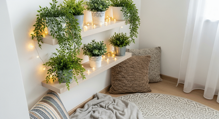
- Plants: Greenery always adds life and a natural pop of color, complementing almost any palette.
The Art of Layering: Texture, Pattern, and Lighting
A truly captivating bedroom isn’t just about color; it’s about the interplay of texture, pattern, and light. These elements add depth, interest, and a multi-sensory experience that makes a room feel rich and inviting, even with a monochromatic palette.
1. Texture: The Unsung Hero of Depth
Texture adds a tactile dimension to your space, preventing it from feeling flat. Think about incorporating:
- Soft & Plush: Velvet pillows, a faux fur throw, a high-pile rug (like a shag or flokati) create a luxurious, cozy feel.
- Rough & Organic: Linen bedding, a jute rug, a woven basket, or a raw wood nightstand bring an earthy, natural vibe.
- Smooth & Polished: Silk pillowcases, a lacquered dresser, or metallic accents (brass, chrome) introduce a touch of sleek sophistication.
- Knitted & Woven: Chunky knit blankets, macrame wall hangings, or woven rattan furniture add artisanal charm.
The key is to mix and match. A linen duvet paired with velvet throw pillows and a chunky knit blanket creates a much more interesting visual and tactile experience than a room full of only one texture.
2. Pattern: Adding Visual Interest
Patterns, when used thoughtfully, can add energy, personality, and a sense of movement to your bedroom. The trick is to vary scale and type.
- Large-Scale Patterns: A bold geometric wallpaper on an accent wall, a large floral print on a duvet cover, or a statement rug can be a dominant visual.
- Medium-Scale Patterns: Striped throw pillows, a subtly patterned curtain, or a botanical print on a chair can bridge the gap between large and small.
- Small-Scale Patterns: Delicate prints on sheets, a subtle herringbone weave in a blanket, or small abstract designs on accent cushions add intricate detail without overwhelming.
When mixing patterns, ensure they share a common color or tone to maintain cohesion. For example, pair a floral print with a stripe and a geometric, as long as they all contain shades of blue and white.
3. Lighting: Setting the Mood
Lighting is paramount in a bedroom, not just for functionality but for ambiance. It can dramatically alter how colors appear and how the room feels.
- Natural Light: Maximize it! Sheer curtains or minimal window treatments allow daylight to flood in, making colors appear truer and the space feel brighter and more expansive.
- Ambient Lighting: A soft overhead fixture (dimmable is key!) provides general illumination. A stylish chandelier or a flush mount from a brand like West Elm can be a design statement.
- Task Lighting: Bedside lamps are essential for reading. Choose lamps with warm-toned bulbs (around 2700K-3000K) to create a cozy glow. Consider adjustable wall-mounted lamps to free up nightstand space.
- Accent Lighting: Small lamps on a dresser, LED strip lighting behind a headboard, or even candles can add layers of light, highlight specific features, and create a truly intimate atmosphere.
Remember, different light sources emit different color temperatures, which can affect your wall color. Always test paint swatches under both natural and artificial light.
Personalizing Your Palette: Feng Shui & Your Unique Style
While trends and color psychology offer excellent starting points, your bedroom should ultimately be a deeply personal reflection of you. Integrating elements of Feng Shui and focusing on your unique aesthetic will ensure your sanctuary truly resonates.
1. Feng Shui Principles for a Harmonious Bedroom
Feng Shui, the ancient Chinese art of placement, offers guidelines for creating balanced and harmonious spaces. For the bedroom, the focus is on promoting rest, romance, and well-being.
- Calming Colors: Feng Shui generally favors soft, muted, and earthy tones for the bedroom. Blues, greens, soft whites, creams, and gentle browns are ideal. Avoid overly bright, stimulating colors like reds and vibrant yellows as dominant shades.
- Balance of Elements: Consider the five elements (Wood, Fire, Earth, Metal, Water) and how colors represent them.
- Wood (Greens, Blues): Growth, vitality.
- Fire (Reds, Oranges): Passion, energy (use sparingly).
- Earth (Browns, Yellows, Terracotta): Stability, grounding.
- Metal (Whites, Grays): Clarity, precision.
- Water (Dark Blues, Blacks): Flow, introspection (use as accents).
Strive for a balanced mix rather than dominance of one element.
- Placement: While not directly color-related, the placement of your bed (commanding position, not directly in line with the door) and avoidance of mirrors facing the bed are crucial for good Feng Shui and contribute to a peaceful feeling that your color scheme supports.
- Declutter: A calm color palette works best in a serene, uncluttered environment. Remove anything that creates stress or reminds you of work.
2. Honoring Your Unique Style
Beyond principles, trust your gut and lean into what you genuinely love. Your bedroom is the perfect place to express your individuality without worrying about impressing guests.
- Inspiration Gathering: Collect images from magazines, Pinterest, or Instagram that speak to you. Notice recurring colors, textures, and moods. Do you consistently gravitate towards light and airy, or dark and dramatic?
- Personal Mementos: Incorporate items that hold sentimental value – a piece of art from a memorable trip, a cherished photograph, a handcrafted item. These personal touches, even if they introduce a new color, make the space uniquely yours.
- Favorite Colors: If you have a deep love for a particular color that isn’t traditionally “bedroom-friendly” (e.g., a vibrant orange), consider using it as a small accent. A throw pillow, a piece of art, or a decorative object can satisfy your desire without overwhelming the calming atmosphere.
- Experiment: Don’t be afraid to try something new! Start with smaller, less permanent elements like throw pillows or a new lamp. Live with them for a bit to see how they make you feel before committing to larger changes.
Your bedroom should tell your story. Let your color choices reflect your personality, your dreams, and what brings you the most comfort and joy.
Avoiding Common Pitfalls: Tips for a Harmonious Space
Even with the best intentions, it’s easy to make mistakes that can disrupt the harmony of your bedroom. Here are some common pitfalls to avoid and how to navigate them:
1. Ignoring the “Fifth Wall” (The Ceiling)
Many people paint their walls and forget the ceiling. A stark white ceiling can sometimes feel cold or chop off the room.
- Solution: Consider painting the ceiling a slightly lighter shade of your wall color, or a very soft, warm white. This creates a more enveloping and cohesive feel.
2. Too Many Competing Colors or Patterns
While layering is good, too many strong colors or clashing patterns can lead to visual clutter and restlessness.
- Solution: Stick to a primary palette of 2-3 main colors and use accents sparingly. If you’re mixing patterns, ensure they share a common color or vary significantly in scale. When in doubt, more neutrals and textures are safer than more patterns.
3. Neglecting Lighting Conditions
Colors appear differently under natural light, incandescent light, LED light, and fluorescent light. A color that looks perfect in a bright showroom might look dull or too intense in your bedroom.
- Solution: Always test paint swatches on your walls. Observe them at different times of day and under both natural and artificial lighting. Pay attention to your room’s orientation – north-facing rooms tend to have cooler light, while south-facing rooms get warmer light.
4. Forgetting the Floor
Your flooring choice (carpet, wood, tile) is a significant color and texture element that needs to be considered in your overall palette.
- Solution: If you have a strong-colored carpet, choose wall colors that complement it. If you have neutral wood or tile, you have more freedom with wall colors, but ensure area rugs tie into the scheme.
5. Overlooking Undertones
Many colors have subtle undertones (blue, green, yellow, pink) that can clash if not considered. A “gray” might lean purple, or a “white” might have a yellow tint.
- Solution: When selecting colors, place swatches next to each other and observe their undertones. If you’re unsure, ask for advice at the paint store or consult a designer. Consistency in undertones (all warm or all cool) often creates a more harmonious look.
6. Choosing Paint First
It’s much easier to match paint to existing fabrics or furniture than the other way around.
- Solution: If you have a beloved piece of art, a patterned rug, or specific bedding you adore, use those items as your inspiration. Pull colors from them for your wall paint, curtains, and other accents.
Key Takeaways
- Color Psychology is Key: Choose hues that evoke your desired mood – blues/greens for calm, warm neutrals for coziness, soft pinks for nurturing.
- Build from a Foundation: Start with a dominant wall color (often a neutral) and then layer in complementary and accent colors through textiles and decor.
- Explore Diverse Palettes: From serene coastal to warm desert modern, find a scheme that resonates with your aesthetic for 2026.
- Layer with Purpose: Integrate color, texture, and pattern through bedding, curtains, rugs, art, and furniture to create depth and interest.
- Personalize & Harmonize: Incorporate Feng Shui principles for balance and always infuse your unique style, ensuring your bedroom is a true sanctuary.
Frequently Asked Questions
Q: What are the best colors for a small bedroom to make it feel larger?
A: For a small bedroom, light and airy colors are your best friends. Crisp whites, pale grays, soft blues, and light greens reflect light, making the space feel more open and expansive. Using a monochromatic scheme with varying shades of the same light color can also create a seamless look that visually stretches the room.
Q: How many colors should I use in my bedroom palette?
A: A general rule of thumb is to stick to a 60-30-10 ratio: 60% dominant color (walls, large furniture), 30% secondary color (curtains, bedding, accent furniture), and 10% accent color (throw pillows, art, decor). This typically translates to 2-3 main colors, plus neutrals. You can introduce slight variations within these, but too many distinct colors can make a room feel chaotic.
Q: Can I use dark colors in a bedroom?
A: Absolutely! Dark colors can create an incredibly cozy, sophisticated, and enveloping atmosphere, perfect for promoting deep sleep. Think deep navy, charcoal gray, forest green, or even a rich plum. To prevent it from feeling too heavy, balance dark walls with lighter bedding, natural wood tones, reflective surfaces (mirrors, metallics), and ample lighting.
Q: How do I choose a color scheme if my bedroom has existing elements I can’t change (e.g., carpet, furniture)?
A: Start by identifying the undertones and dominant colors in your existing elements. If you have a warm-toned carpet, lean into warm wall colors and decor. If your furniture is a cool-toned wood, choose cool-toned paints. Use these existing elements as your starting point, pulling complementary or analogous colors from them to build a cohesive palette around what you already have.
Q: What’s the best way to test paint colors before committing?
A: Purchase sample pots and paint large swatches (at least 12×12 inches) directly onto your walls, on different walls if possible. Observe how the colors look throughout the day and night, under both natural and artificial light. Don’t just look at a small chip; a larger area will give you a much better sense of the color’s true appearance in your space.
Creating your dream bedroom color scheme is an exciting journey of self-expression and thoughtful design. By understanding the power of color psychology, exploring popular palettes, and mastering the art of layering, you’re well on your way to crafting a sanctuary that not only looks beautiful but also nurtures your soul. Remember, your home is your canvas, and your bedroom is your most intimate masterpiece. Embrace the process, trust your instincts, and enjoy the profound impact a perfectly chosen palette will have on your daily life.
Article by Eleanor Vance, Lead Interior Designer at Rock Salt Plum.