


html
Welcome to Rock Salt Plum, where we believe your home should be a reflection of your inner peace and personal style. In a world brimming with fleeting trends, there’s an enduring elegance in simplicity, a quiet power in subtlety. This is precisely what a well-executed neutral home decor color palette offers. Far from being boring or bland, neutrals provide a sophisticated foundation, a canvas upon which you can paint a life of tranquility, comfort, and understated luxury. As we look towards 2026, the desire for spaces that nurture the soul and offer a respite from the hustle and bustle is stronger than ever. Embracing neutrals allows for unparalleled versatility, enabling you to effortlessly refresh your home’s aesthetic with seasonal accents or evolving personal tastes, all while maintaining a cohesive and serene atmosphere. Join us as we delve into the art of selecting, layering, and living with neutrals, transforming your home into a timeless sanctuary designed for modern living.
The Enduring Allure of Neutral Home Decor Palettes
In the realm of interior design, a neutral color palette is often hailed as the ultimate chameleon, effortlessly adapting to various styles, from minimalist chic to cozy farmhouse, and even modern bohemian. Its widespread appeal stems from an inherent ability to create spaces that feel both expansive and inviting, sophisticated yet serene. Unlike bold hues that can sometimes overwhelm or quickly fall out of fashion, neutrals offer a timeless elegance that transcends trends. They provide a calming backdrop, allowing architectural details, textures, and personal treasures to take center stage.
The psychological impact of neutrals is profound. Colors like warm whites, soft grays, gentle beiges, and earthy taupes have a natural calming effect, reducing visual clutter and promoting a sense of peace and order. This makes them ideal for fostering an environment conducive to relaxation and well-being, a crucial aspect of Self Care Ideas At Home 2026. Imagine stepping into a living room bathed in soft, harmonious tones after a long day – the immediate sense of calm is palpable. This tranquility is not just aesthetic; it contributes to a mindful living space, encouraging moments of quiet reflection and rejuvenation.
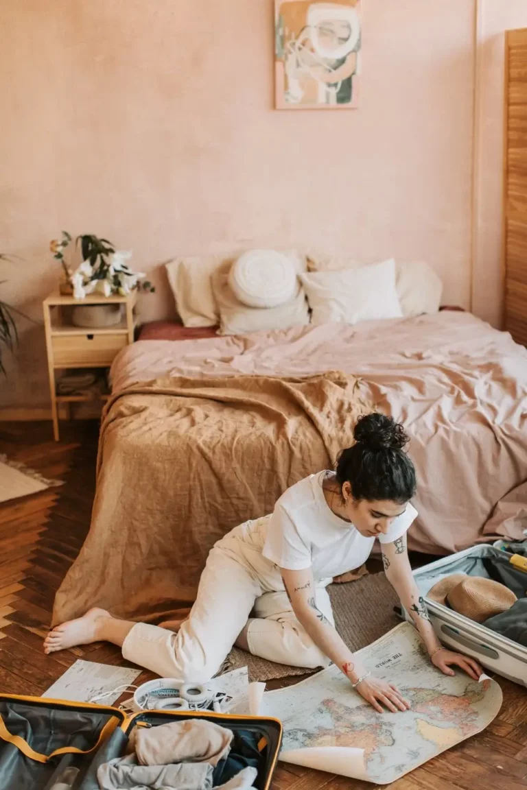
Furthermore, a neutral foundation offers incredible flexibility. It empowers homeowners to introduce pops of color through accessories, artwork, or textiles, changing the entire mood of a room with minimal effort and investment. This adaptability is particularly beneficial for those seeking Home Decor Ideas Budget 2026, as it allows for periodic refreshes without the need for expensive repainting or large furniture replacements. For renters navigating the nuances of Decorate Rental Apartment Tips, neutrals provide a non-committal yet stylish solution, allowing for personalization without permanent alterations. They make small spaces feel larger and bring a sense of cohesion to open-plan living. The enduring allure of neutrals lies in their ability to create a backdrop that is both sophisticated and versatile, serving as the perfect canvas for your evolving life and style.
Decoding the Nuances: Understanding Neutral Tones

To truly master the neutral home decor color palette, it’s essential to understand that “neutral” is not synonymous with “boring.” Instead, it encompasses a rich spectrum of subtle variations, each with its own undertone and character. These undertones are what give neutrals their warmth, coolness, or crispness, profoundly influencing the overall ambiance of a room. Identifying these nuances is the first step toward crafting a cohesive and inviting space.
Warm Neutrals: Embracing Comfort and Coziness
Warm neutrals are those with yellow, red, or orange undertones. They evoke a sense of comfort, coziness, and intimacy, making them perfect for creating inviting and welcoming spaces.
- Beige: A classic warm neutral, beige ranges from light sandy tones to deeper khaki. It pairs beautifully with natural wood, cream, and soft browns, creating a grounded and organic feel.
- Cream: Softer than pure white, cream possesses a subtle yellow undertone that lends warmth and richness. It’s excellent for creating a luxurious and gentle atmosphere, especially when layered with other warm textures.
- Taupe: A sophisticated blend of brown and gray, taupe often leans warm with a hint of red or purple undertone. It offers a deeper, more grounding alternative to beige, providing elegance and depth.
- Greige (Warm): While often considered a true neutral, some greiges lean distinctly warm, incorporating more beige than gray. These shades offer the best of both worlds – the warmth of beige with the sophistication of gray.
- Mushroom: A muted, earthy brown-gray, mushroom is incredibly versatile and possesses a natural warmth, reminiscent of woodland floors. It creates a serene and organic backdrop.
These colors work exceptionally well in living rooms, bedrooms, and dining areas where a sense of warmth and hospitality is desired. They also respond beautifully to natural light, appearing even more radiant and inviting.
Cool Neutrals: Cultivating Serenity and Sophistication
Cool neutrals have blue, green, or purple undertones. They tend to create a sense of calm, spaciousness, and modern sophistication. These shades are excellent for promoting a clean, crisp, and airy feel.
- Soft Gray: From silvery grays to deeper charcoal, cool grays are incredibly versatile. They can make a space feel chic and contemporary, especially when paired with crisp whites and metallic accents.
- Blue-Gray: As the name suggests, this neutral has a discernible blue undertone, offering a soothing and tranquil quality. It’s reminiscent of coastal landscapes or misty mornings, perfect for bathrooms or bedrooms.
- Greige (Cool): A greige with a stronger gray presence and a hint of blue or green offers a contemporary edge. It’s less stark than a pure gray but retains a cool, sophisticated appeal.
- Off-White (Cool): Whites with subtle gray or blue undertones can read as crisp and modern. They create a clean canvas, ideal for minimalist designs or enhancing natural light.
Cool neutrals are often favored in spaces where clarity and focus are paramount, such as home offices, or in rooms designed to evoke a spa-like tranquility, like master bathrooms. They also pair well with cool-toned materials like polished chrome, marble, and concrete.
True Neutrals: The Balanced Foundation
True neutrals are those without strong discernible warm or cool undertones, making them incredibly adaptable and easy to work with.
- Pure White: The ultimate clean slate, pure white is crisp, bright, and reflects light beautifully, making spaces feel larger and more open. It provides a stark contrast that allows textures and forms to truly stand out.
- Balanced Greige: A perfect balance of gray and beige, a truly neutral greige can bridge the gap between warm and cool elements in a room, offering a harmonious and sophisticated backdrop.
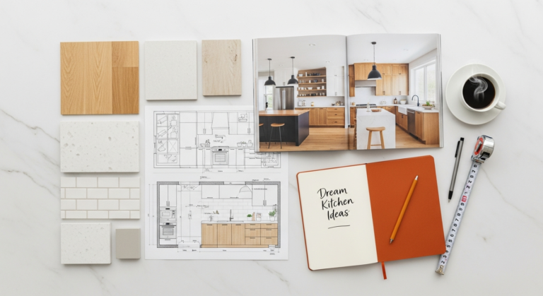
Understanding these distinctions is paramount. Before committing to a color, observe how different neutral swatches appear in your home’s unique lighting conditions throughout the day. A color that looks perfectly balanced in the store might reveal an unexpected undertone once it’s on your wall, reacting to your specific natural and artificial light sources. This careful consideration ensures your chosen neutral palette perfectly complements your home’s character and your desired mood.
Crafting Your Harmonious Neutral Palette
Creating a cohesive and inviting neutral space involves more than just picking a single paint color. It’s about building a layered palette that combines various neutral tones, textures, and subtle accents to achieve depth and visual interest. This deliberate approach ensures your neutral decor feels rich and dynamic, never monotonous.
Step 1: Identify Your Base Neutral
Begin by selecting your primary neutral color, which will typically cover the largest surfaces – walls, large furniture pieces like sofas, or expansive rugs. This foundational shade will dictate the overall temperature and mood of the room.
- For a Warm & Inviting Feel: Opt for warm beiges, creamy off-whites, or a golden-toned greige. These are excellent for creating cozy living areas and bedrooms.
- For a Modern & Serene Vibe: Choose soft grays, cool whites, or a blue-tinged greige. These work well in contemporary spaces, bathrooms, and areas where you desire a crisp, clean aesthetic.
- For Ultimate Versatility: A truly balanced greige or a pure, crisp white offers the most flexibility, allowing you to easily shift between warm and cool accents.
Consider your home’s existing elements – flooring, built-ins, and natural light – when making this crucial decision. These fixed elements can have their own undertones that should be considered for a harmonious blend.
Step 2: Introduce Complementary Neutrals
Once your base is established, introduce other neutral tones to add dimension. These can be shades from the same family (e.g., a lighter and darker beige) or complementary neutrals with different undertones (e.g., a warm gray sofa with creamy white walls).
- Layering Tones: Use varying shades of your chosen neutral. If your walls are a light greige, perhaps a sofa in a slightly darker taupe or curtains in a creamy off-white. This creates subtle contrast without introducing stark color.
- Mixing Warm and Cool: Don’t be afraid to combine warm and cool neutrals judiciously. A warm beige wall can be beautifully balanced by a cool-toned gray accent chair, adding sophistication and preventing the room from feeling monochromatic. The key is balance – ensure one temperature dominates or they are present in roughly equal measure.
- Consider Fixed Elements: Pay attention to your flooring, cabinetry, or fireplace. These are often neutral themselves and should be factored into your complementary palette.
Step 3: Layering Textures and Materials
This is perhaps the most critical step in preventing a neutral room from feeling flat. Texture adds visual interest, depth, and a tactile quality that invites touch and interaction. Without color to differentiate elements, texture becomes paramount.
- Soft Furnishings: Incorporate plush velvet cushions, chunky knit throws, linen drapes, and wool rugs. Mix smooth silks with nubby bouclés, or crisp cottons with shaggy sheepskin.
- Natural Materials: Introduce rattan, jute, sisal, wood (both raw and polished), stone, concrete, and ceramic. A woven jute rug, a wooden coffee table, and ceramic vases add organic warmth and visual weight.
- Architectural Elements: Exposed brick, textured wallpaper, or wall paneling can introduce subtle texture without adding color.
- Reflective Surfaces: Glass, polished metals (brass, chrome, matte black), and mirrors reflect light and add another layer of visual interest, breaking up flat surfaces.
The interplay of different textures creates a rich sensory experience, making the space feel luxurious and thoughtfully designed, even with a limited color palette.
Step 4: Incorporating Subtle Color Accents
While the core of your palette is neutral, introducing subtle pops of color can elevate the space and inject personality without overpowering the calm aesthetic.
- Nature-Inspired Hues: Think muted greens (sage, olive), soft blues (dusty blue, slate), or gentle terracotta tones. These colors feel organic and blend seamlessly with a neutral backdrop.
- Metallics: Gold, brass, silver, and matte black can act as sophisticated accents, adding sparkle or grounding elements.
- Artwork: Choose pieces with a limited color palette or artwork that uses neutrals predominantly but features a single, subtle accent color.
- Books & Botanicals: A stack of beautifully bound books or a vibrant green plant can provide natural, understated color.
- Seasonal Updates: This is where Home Decor Ideas Budget 2026 truly shines. Change out throw pillows, vases, or small decorative objects with seasonal colors to refresh your space without major investment. For example, introduce deep berries or burnt oranges in autumn, and soft pastels in spring.
The key is restraint; let the neutral foundation be the star, with accents serving as supporting players that enhance, rather than dominate, the overall serene atmosphere.
Practical Applications: Designing with Neutrals in Every Room

The beauty of a neutral home decor color palette lies in its versatility, allowing it to transform any room into a haven of tranquility and style. From bustling living areas to intimate bedrooms, understanding how to apply neutrals effectively in different spaces is key to a cohesive and inviting home.
The Living Room: A Sanctuary of Serenity
The living room is often the heart of the home, a place for relaxation, entertaining, and connection. A neutral palette here creates an immediate sense of calm and spaciousness. Start with a foundational neutral for walls – perhaps a warm off-white or a light greige to open up the space. For larger furniture pieces like sofas, opt for durable fabrics in a complementary neutral, such as a charcoal gray linen or a creamy beige boucle. Layer in texture with natural fiber rugs (jute, wool), velvet throw pillows, and chunky knit blankets. Incorporate wooden coffee tables, ceramic vases, and metallic accents in lighting or decorative objects. Artwork featuring abstract forms or natural landscapes in muted tones will enhance the serene atmosphere. For Home Decor Ideas Budget 2026, consider slipcovers for existing sofas to instantly update their look in a neutral fabric, or DIY painted furniture in a soft gray or white. A neutral living room provides the perfect backdrop for social gatherings and quiet evenings alike.
The Bedroom: Your Personal Retreat
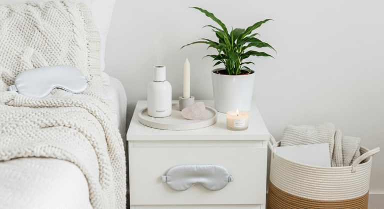
In the bedroom, neutrals are paramount for fostering a truly restful environment. Think soft, ethereal layers that promote relaxation and sleep. Begin with walls in a soothing cool gray, a gentle cream, or a warm white. Choose bedding in luxurious natural fabrics like linen or organic cotton in varying shades of white, cream, or light taupe. Layer a plush duvet with a textured coverlet and several pillows in different sizes and textures – perhaps a crisp white standard pillow, a soft linen sham, and a chunky knit decorative pillow. A large, soft rug underfoot adds warmth and absorbs sound. Wooden furniture, such as a reclaimed wood headboard or bedside tables, introduces natural warmth. Ambient lighting, dimmable lamps, and blackout curtains in a coordinating neutral complete this personal sanctuary, making it a perfect space for Self Care Ideas At Home 2026, like mindful meditation or quiet reading.
The Kitchen & Dining: Understated Elegance
Neutrals in the kitchen and dining areas create a clean, sophisticated, and always-in-style aesthetic. White or light gray cabinetry paired with natural stone countertops (marble, quartz, granite) forms a timeless foundation. Introduce warmth through wooden dining tables, woven bar stools, and textured ceramic dinnerware. Metallic hardware (brass pulls, brushed nickel faucets) adds a touch of understated luxury. For dining, linen tablecloths, simple neutral place settings, and a centerpiece of fresh greenery or white flowers maintain the elegant simplicity. In a rental kitchen, where major renovations aren’t possible, focus on neutral accessories: canisters, dish towels, and cutting boards. For Decorate Rental Apartment Tips, consider temporary backsplash tiles in a neutral pattern or simply use neutral-toned cooking utensils and serving dishes to elevate the space without permanent changes. The neutral kitchen is both highly functional and beautifully inviting.
The Bathroom: Spa-like Tranquility
Transform your bathroom into a serene, spa-like escape with a neutral palette. White is often the go-to for fixtures and tiles, creating a pristine and hygienic feel. Enhance this with soft gray or warm beige walls. Layer with plush white or light-colored towels, a natural wood bath mat, and woven baskets for storage. Introduce greenery with potted plants like ferns or eucalyptus for a touch of organic color and freshness. Scented candles and diffusers in calming aromas further enhance the spa experience, contributing to Self Care Ideas At Home 2026. Metallic accents in fixtures (chrome, brushed gold) and a large mirror will reflect light and amplify the sense of space. For renters, focus on luxurious towels, stylish storage, and high-quality bath products in neutral packaging to create an elevated feel.
Entryways & Hallways: Welcoming Simplicity
Often overlooked, entryways and hallways are crucial for making a first impression and setting the tone for your home. A neutral palette here ensures a clean, uncluttered welcome. Light-colored walls will brighten these often windowless spaces, making them feel more expansive. A durable neutral runner rug adds warmth and defines the path. Introduce a simple console table in natural wood or a painted neutral, adorned with a minimalist mirror, a small plant, and a stylish catch-all tray. Subtle artwork or a gallery wall featuring black and white photography can add personality without overwhelming. Good lighting is key; a statement pendant or well-placed sconces can elevate the space. For Decorate Rental Apartment Tips, focus on removable wall hooks for coats, a stylish shoe rack, and a beautiful neutral doormat to make a big impact in a small space.
Elevating Your Neutral Space: Beyond the Basics
While a neutral home decor color palette provides an excellent foundation, true mastery lies in the art of elevation – introducing elements that add depth, interest, and a touch of the extraordinary. This goes beyond simply choosing colors; it involves thoughtful consideration of lighting, natural elements, art, and even sustainable choices.
The Power of Lighting: Sculpting Your Neutral Canvas
Lighting is arguably the most crucial element in a neutral space, as it dramatically influences how colors are perceived and how textures come to life. Without vibrant hues, the interplay of light and shadow becomes even more vital.
- Natural Light: Maximize natural light by keeping windows unobstructed. Use sheer linen or cotton curtains in light neutrals to filter light softly while maintaining privacy.
- Layered Artificial Lighting: Employ a combination of ambient (overhead), task (reading lamps), and accent (spotlights on art) lighting. This creates depth and allows you to adjust the mood.
- Warm vs. Cool Tones: Choose light bulbs with a color temperature that complements your neutral palette. Warm white bulbs (2700K-3000K) enhance warm neutrals, creating a cozy glow. Cooler white bulbs (3500K-4000K) pair well with cool neutrals, promoting a crisp, modern feel.
- Statement Fixtures: Even in a neutral room, a sculptural pendant light or an elegant floor lamp can serve as a focal point, adding architectural interest and a touch of sophistication.
Thoughtful lighting can transform a flat neutral room into a dynamic and inviting environment, highlighting textures and creating captivating shadows.
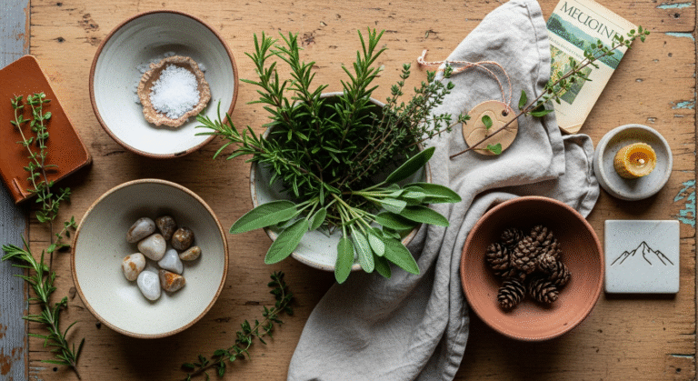
Incorporating Natural Elements: Organic Warmth and Life
Bringing the outdoors in is a timeless design principle, and it’s particularly effective in neutral spaces, where natural elements provide organic texture, subtle color, and a sense of grounding.
- Greenery: Live plants are indispensable. From a large fiddle-leaf fig to delicate ferns or a minimalist olive tree, plants introduce vibrant life and a natural pop of green that complements any neutral. For Self Care Ideas At Home 2026, caring for plants can be a meditative and rewarding activity, connecting you with nature even indoors.
- Wood: Incorporate various types of wood – light oak, rich walnut, distressed reclaimed wood – in furniture, flooring, or decorative objects. The grain and natural variations of wood add unparalleled warmth and character.
- Stone & Ceramic: Marble countertops, terracotta pots, ceramic vases, and stone accessories bring an earthy, tactile quality.
- Woven Textures: Rattan chairs, jute rugs, wicker baskets, and linen textiles add a relaxed, organic texture that softens sharp lines and enhances comfort.
These elements connect your home to the natural world, promoting a sense of calm and well-being.
Art and Accessories as Focal Points
In a neutral setting, every piece of art and every accessory has the opportunity to shine. They become deliberate focal points, telling a story or adding a touch of personality.
- Statement Art: Choose one or two impactful pieces of art. This could be a large abstract painting with a limited, muted color palette, a striking black and white photograph, or a textural fiber art piece. The art doesn’t need to be overtly colorful; its form, composition, and texture can be enough to draw the eye.
- Curated Collections: Display carefully selected decorative objects – unique pottery, vintage finds, sculptural elements, or travel souvenirs. These items add character and depth.
- Books: Arrange books by color (even if all neutral) or size on shelves and coffee tables. Their spines offer subtle texture and a lived-in feel.
- Mirrors: Beyond their functional purpose, mirrors reflect light and expand space. Choose mirrors with interesting frames (wood, metal, or an ornate vintage find) to add decorative flair.
The key is curation over accumulation; each item should feel intentional and contribute to the overall aesthetic. This also aligns with Home Decor Ideas Budget 2026 by encouraging thoughtful purchasing of fewer, more impactful pieces.
Reflective Surfaces: Adding Sparkle and Depth
Reflective surfaces are fantastic for adding a subtle glamour and enhancing the play of light in a neutral room.
- Glass: Glass tabletops, vases, and decorative bowls add a delicate sparkle and lightness.
- Metals: Introduce metals through hardware, lighting fixtures, frames, or decorative objects. Polished brass adds warmth, chrome offers a sleek modern touch, and matte black provides a grounding contrast.
- Lacquered Finishes: A piece of furniture with a high-gloss lacquered finish can add a sophisticated sheen and reflect light beautifully.
These elements prevent a neutral space from feeling too flat, adding dynamic highlights that catch the eye.
Sustainable Choices for 2026: Designing with Conscience
As we move towards 2026, conscious consumption and sustainable living are more than just trends – they’re imperatives. Incorporating eco-friendly choices into your neutral decor enhances its timeless appeal and aligns with a mindful lifestyle.
- Natural & Organic Materials: Prioritize furniture and textiles made from sustainable materials like organic cotton, linen, hemp, bamboo, recycled wool, and sustainably sourced wood.
- Vintage & Secondhand: Embrace the charm of vintage and antique pieces. Thrifting and buying secondhand is an excellent way to find unique items, reduce waste, and incorporate Home Decor Ideas Budget 2026. These pieces often come with a beautiful patina that adds character to a neutral room.
- Durable & High-Quality: Invest in well-made, durable items that will last for years, reducing the need for frequent replacements. Neutrals, being timeless, encourage this approach.
- Local & Artisanal: Support local artisans and businesses that use ethical and sustainable practices. Handmade items often bring a unique texture and story to your home.
- Non-Toxic Paints & Finishes: Choose low-VOC or zero-VOC paints and natural finishes to ensure a healthier indoor environment, contributing positively to your Self Care Ideas At Home 2026.
Designing with sustainability in mind not only creates a beautiful home but also fosters a deeper connection to your space and the planet.
Neutral Decor on a Budget and for Rentals
One of the most appealing aspects of a neutral home decor color palette is its inherent adaptability, making it an ideal choice for those managing budgets or decorating rental properties. The timelessness and versatility of neutrals mean you can achieve a sophisticated and personalized look without breaking the bank or violating lease agreements.
Savvy Spending: Home Decor Ideas Budget 2026 with Neutrals
Creating a stunning neutral home doesn’t require an unlimited budget. In fact, neutrals lend themselves perfectly to smart, cost-effective decorating strategies, making them a top choice for Home Decor Ideas Budget 2026.
- Prioritize Big-Ticket Items: Invest in good quality, durable foundational pieces like a sofa or a dining table in timeless neutral colors. These items will last longer and provide a versatile base for future changes. Look for sales, factory outlets, or consider financing options for these key pieces.
- Paint Smartly: Paint is one of the most transformative and cost-effective updates. A fresh coat of a light, neutral paint can instantly brighten and modernize a room. For an even tighter budget, consider painting only accent walls or refreshing trim and doors.
- Thrift and Upcycle: Secondhand stores, flea markets, and online marketplaces are treasure troves for neutral decor. Look for wooden furniture that can be painted, ceramic vases, or unique frames. A little sanding and a fresh coat of neutral paint (white, gray, or black) can completely transform a dated piece into a chic accent.
- DIY Textiles: Sew your own throw pillow covers from inexpensive neutral fabrics, or dye existing textiles a new neutral shade. Simple hemmed linen panels can make elegant curtains without the custom price tag.
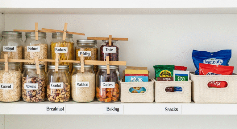
- Focus on Texture: As discussed, texture is key in neutral spaces. Incorporate budget-friendly textured items like woven baskets, faux sheepskin rugs, jute placemats, and chunky knit throws. These items add depth and interest without significant cost.
- Greenery on a Budget: While larger plants can be an investment, smaller succulents, propagated plant cuttings, or even foraged branches can bring natural elements into your home for minimal cost.
- Shop Sales for Accents: Keep an eye out for sales on decorative accessories, candles, and small art pieces in neutral tones. These can be swapped out seasonally to refresh your space without overspending.
By focusing on quality foundational pieces, smart DIYs, and strategic thrifting, you can curate a beautiful and cohesive neutral home that feels luxurious, even on a tight budget.
Decorate Rental Apartment Tips with Neutrals
Renting often comes with restrictions on painting and permanent alterations, but a neutral palette provides countless opportunities for personalization and style without violating your lease. These Decorate Rental Apartment Tips leverage the flexibility of neutrals to create a temporary home that feels uniquely yours.
- Embrace Your Walls (Temporarily): If you can’t paint, embrace the existing wall color. If it’s a stark white, use it as a crisp backdrop for warm wood tones and creamy textiles. If it’s an off-white, choose complementary neutrals. Removable wallpaper or temporary wall decals in subtle neutral patterns can add personality without permanence.
- Large Neutral Rugs: A sizable neutral area rug can cover unattractive flooring and define zones in an open-plan rental. It anchors the room, adds warmth, and introduces texture.
- Freestanding Furniture: Opt for freestanding bookcases, cabinets, and storage units in neutral finishes (white, light wood, gray). These can be easily moved and don’t require wall mounting.
- Textile Power: This is your secret weapon. Use curtains, throws, pillows, and bedding to introduce your chosen neutral palette. They add softness, texture, and the ability to layer different shades. Choose light, airy fabrics for curtains to maximize light.
- Strategic Lighting: Bring in your own lamps – floor lamps, table lamps, and even plug-in wall sconces. These can dramatically improve the ambiance of a rental that might have harsh overhead lighting.
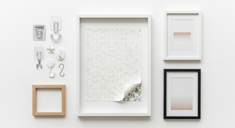
- Art That Doesn’t Damage Walls: Use command strips, adhesive hooks, or lean large art pieces against walls for a chic, no-nail solution. Create a gallery wall with neutral-toned frames and artwork.
- Greenery Galore: Plants are renter-friendly and bring life and natural color. Use attractive neutral planters to tie them into your decor.
- Personalized Storage: Baskets, decorative boxes, and stylish containers in neutral materials (wicker, felt, canvas) help keep clutter at bay and add to the aesthetic.
- Mirror Magic: Large mirrors leaned against a wall or hung with temporary hooks can make a small rental feel much more expansive and reflect light beautifully.
Neutrals empower renters to create a sophisticated, personalized space that feels like home, all while respecting the terms of their lease. The focus shifts from permanent changes to thoughtfully curated, movable elements that make a significant impact.
The Wellness Connection: Neutrals and Self-Care
At Rock Salt Plum, we firmly believe that your home is an extension of your well-being. The choices we make in our living spaces profoundly impact our mental and emotional states. This is where the neutral home decor color palette truly shines, acting as a powerful tool in cultivating an environment conducive to self-care and mindful living, a cornerstone of Self Care Ideas At Home 2026.
A neutral palette inherently promotes a sense of calm and order. In a world often characterized by sensory overload and constant stimulation, returning to a home bathed in soft, harmonious tones offers immediate respite. The absence of jarring colors reduces visual noise, allowing the mind to quiet down and relax. This creates a sanctuary where you can truly unwind, de-stress, and recharge. Imagine a bedroom with creamy walls, layered with linen bedding in soft taupes and off-whites – such a space invites deep sleep and peaceful mornings, essential components of a robust self-care routine.
Furthermore, the simplicity and understated elegance of neutrals encourage mindfulness. When a space isn’t cluttered with competing colors or patterns, our attention is naturally drawn to textures, natural light, and the subtle beauty of carefully chosen objects. This encourages us to be present,
Recommended Resources
For more on neutral home decor, see How To Style A Classic White Button Down Shirt Outfits on The Contextual Life.
Check out How To Do A Natural Makeup Look Guide on Fashion Goggled for a deeper dive.